Reimagining Storage Monitoring for Enterprise Scale
A 2-year platform vision turned into production-ready design for a leading enterprise SaaS provider.
Enterprise storage is complex. But it doesn’t have to feel that way.
I helped a leading data storage company rethink monitoring for enterprise storage admins managing more than 100 arrays. I led the charge on auditing the system, listening to users, and building a vision that made the complex feel clear. We shifted from infrastructure-first to intent-first. From data dumps to guided insight. From reactive to proactive.
Then I took that big vision and made it real, translating part of it into production-ready designs that are already helping the team move forward.
What I did
Cross Functional Workshops
The User
Storage admins keep company data running smoothly. They rely on tools to track performance, prevent outages, and maintain system health.
The Prodcut
Pure1 is Pure Storage’s cloud platform that lets admins monitor performance, manage capacity, and plan ahead.
The Problem
As enterprise customers grew to hundreds of arrays, Pure1 became fragmented. Monitoring, alerts, and investigations lived in silos, forcing admins to rebuild context constantly.
The Challenge
Redesign Pure1 into a unified platform that scales, connects workflows, and turns data overload into actionable insight.
What We Saw After Launch
After the production work rolled out, Pure ran a beta program with enterprise admins managing large fleets. Early feedback and data told a clear story.
Usage Metrics
+24% Faster
issue detection and resolution
User Feedback
+45%
increase in confidence for managing large fleets
Enterprise Growth
+$15–20M
in potential new enterprise revenue
In the beta, admins felt more confident and in control when managing 50+ arrays. Issue detection and resolution were about 25% faster, based on support data and user logs. Simplifying monitoring at scale also helped reengage large customers, unlocking an estimated $25–40M in new enterprise revenue.
What Changed
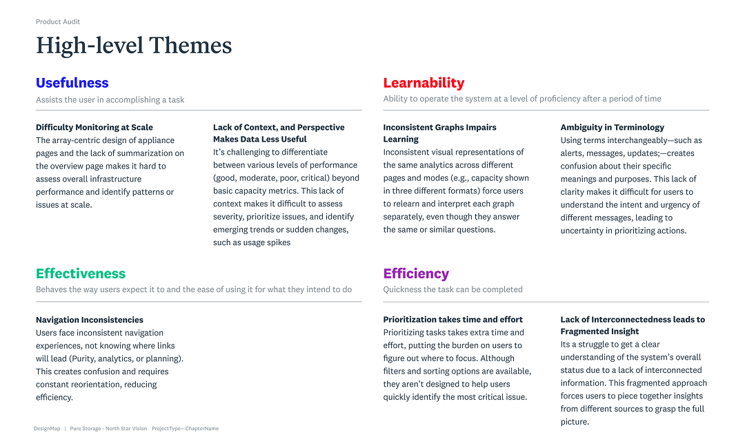
From Noise → Clarity
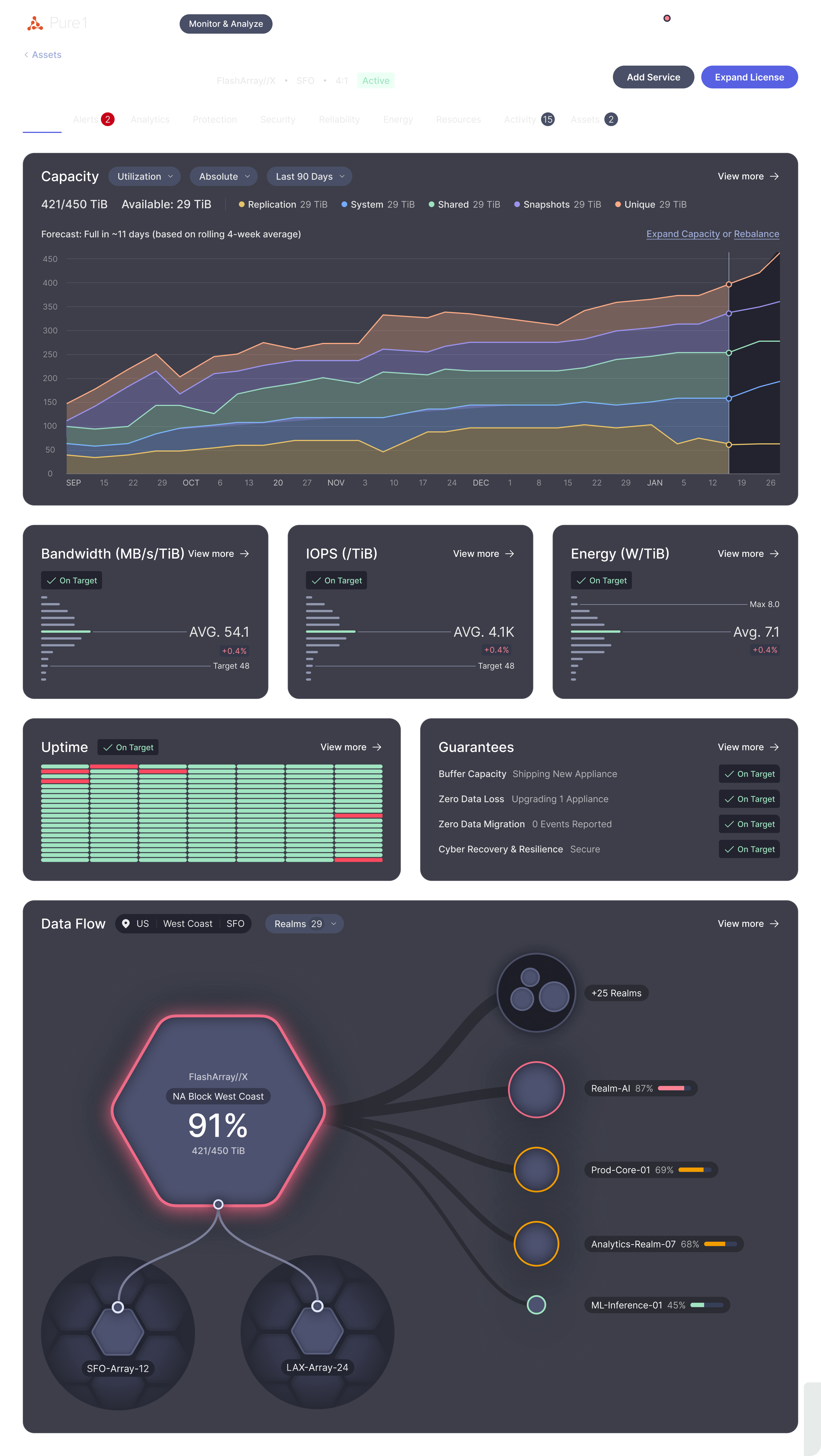
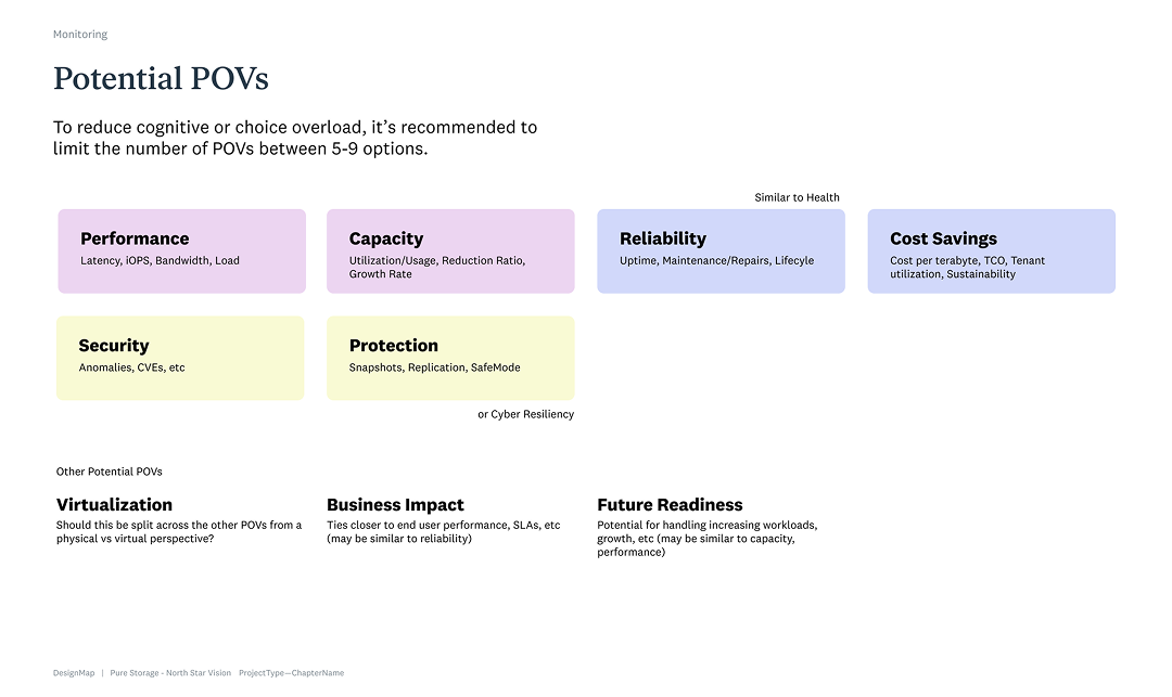
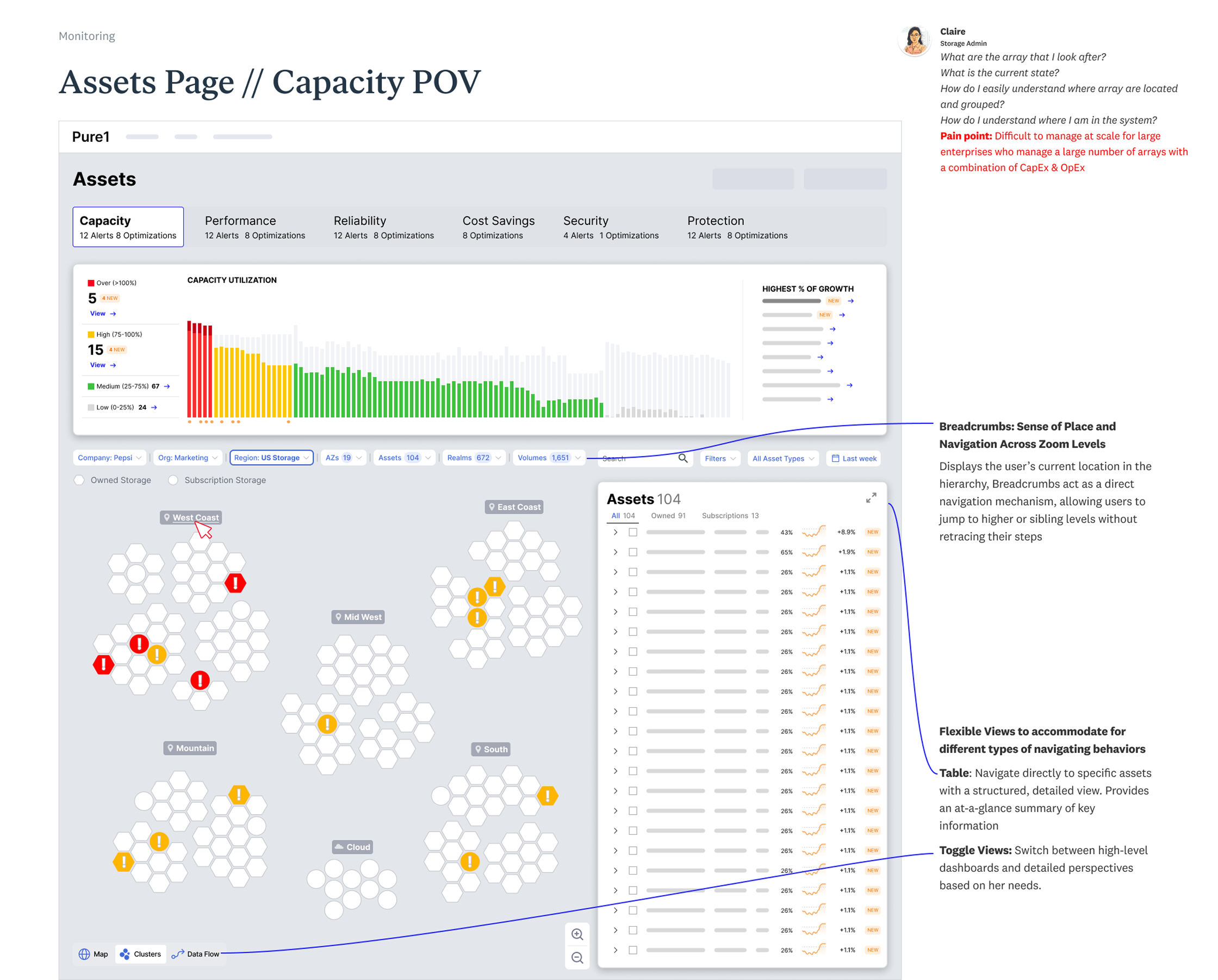
Tailored Points of View (POVs) provide role-specific insights, helping users monitor performance, capacity, and reliability through the lens that fits their goals.
From Fragmented → Connected
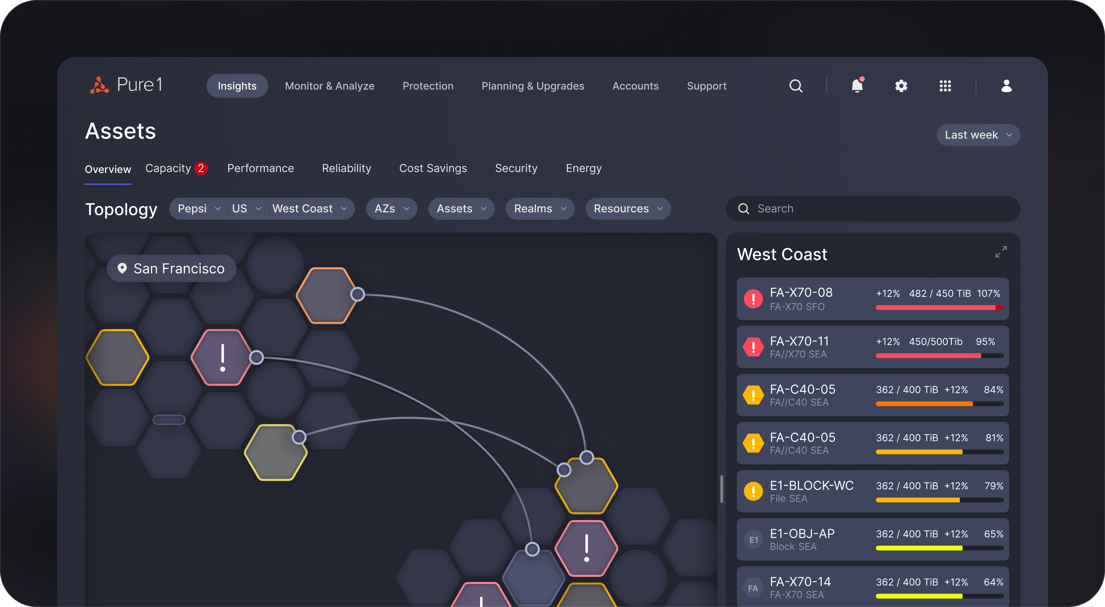
A centralized asset page consolidates arrays, licenses, and analytics into one place, streamlining monitoring and decisions across the entire environment.
From Reactive → Proactive
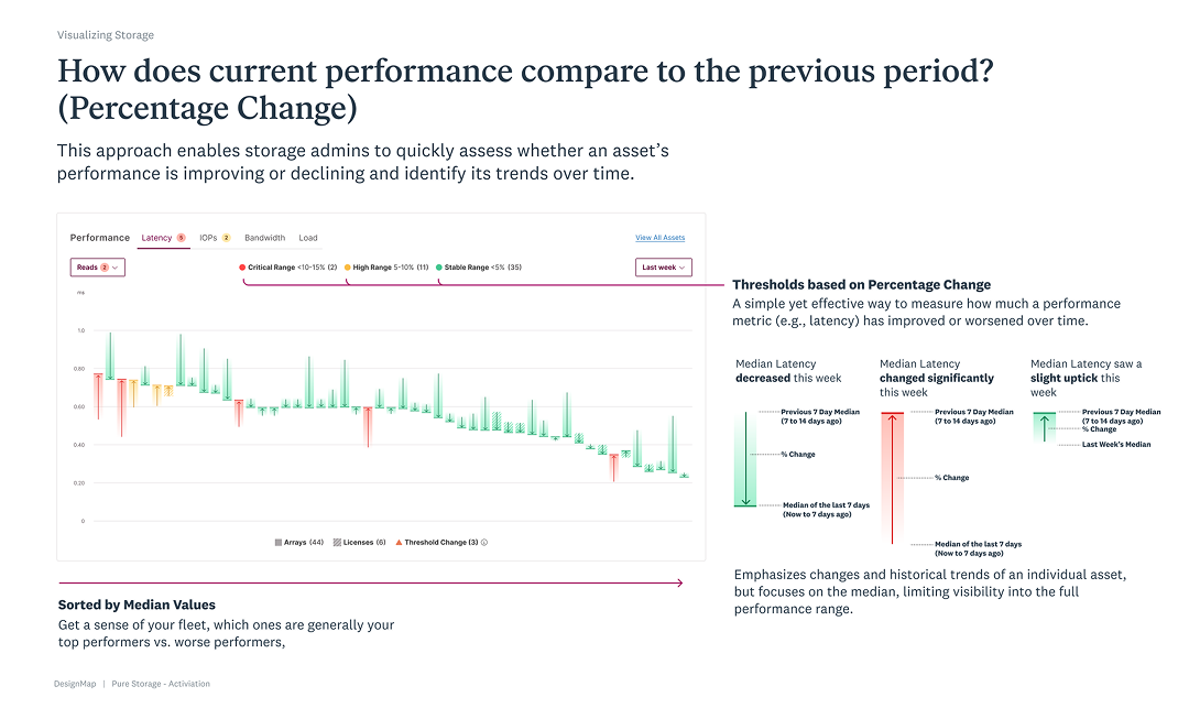
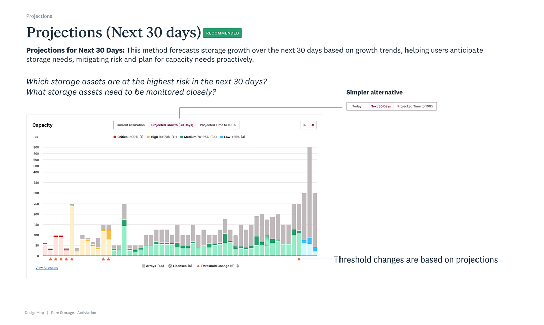
Clear visualizations expose relationships, dependencies, and emerging risks, empowering admins to act early, prevent issues, and optimize performance at scale.
How I Tackled It
Started with an honest audit
I mapped every screen, workflow, and dead end. The system made sense to the database, not to the people using it. Monitoring was fragmented and object-based—great for storage engineers, terrible for humans.
Listened to the people doing the work
Admins managing 100+ arrays didn’t want more data—they wanted meaning. They showed us how they relied on naming conventions and gut instinct to fill the gaps. That insight reframed the problem from data overload to context deficit.
Modeled the system, not just the UI
I visualized how arrays, licenses, and workloads connect. Those maps helped everyone see what users saw—and what they didn’t. It turned complexity into something we could reason about together.
Shifted from infrastructure-first to intent-first
We designed Points of View focused lenses for capacity, performance, reliability, and sustainability. Each one surfaced what changed, why it mattered, and what to do next.
Worked in the open
I partnered with PMs, engineers, and other designers to test, refine, and translate ideas into something real. It wasn’t just cleaner design, it was shared understanding.
Making Sense of the Mess
It Wasn’t the Data, It Was the Context
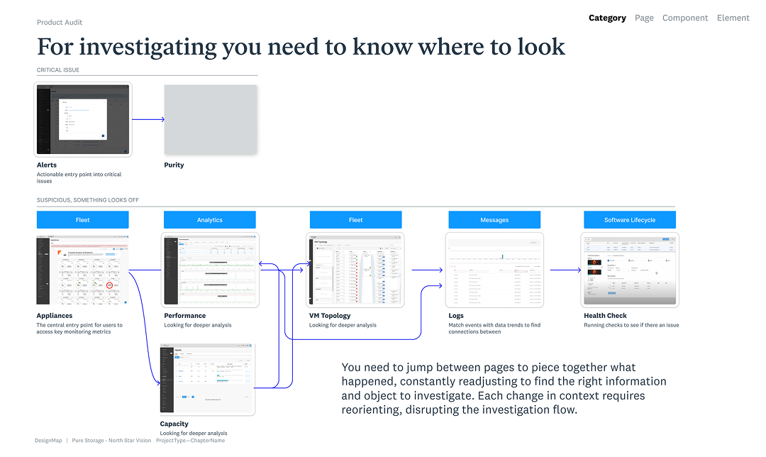
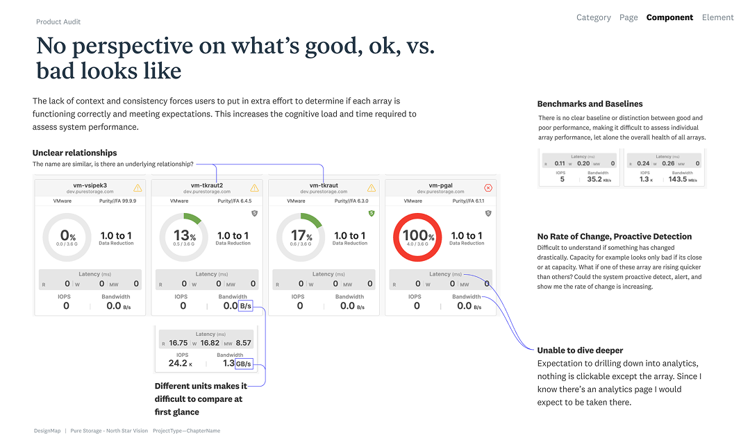
Before designing anything new, we needed to understand what wasn’t working. I ran a detailed audit across Pure1’s monitoring, investigation, and alerting flows. I mapped every page, metric, and interaction to see how admins actually made sense of their data.The audit exposed a simple truth: users weren’t struggling because the data was wrong. They were struggling because it didn’t make sense in context.
Too Many Pages, Not Enough Continuity
Every page demanded reorientation. Admins bounced between Performance, Capacity, and Analytics, manually filtering and refiltering to chase a thread of meaning. Each transition broke continuity and forced them to start over.
Monitoring had grown organically across products like Pure1 and Fusion. Each served a purpose, but none told a complete story. I started by mapping relationships between arrays, licenses, and volumes—how data flowed, where it broke, and why users got lost. I modeled the system end-to-end, revealing patterns that had been hidden in plain sight.
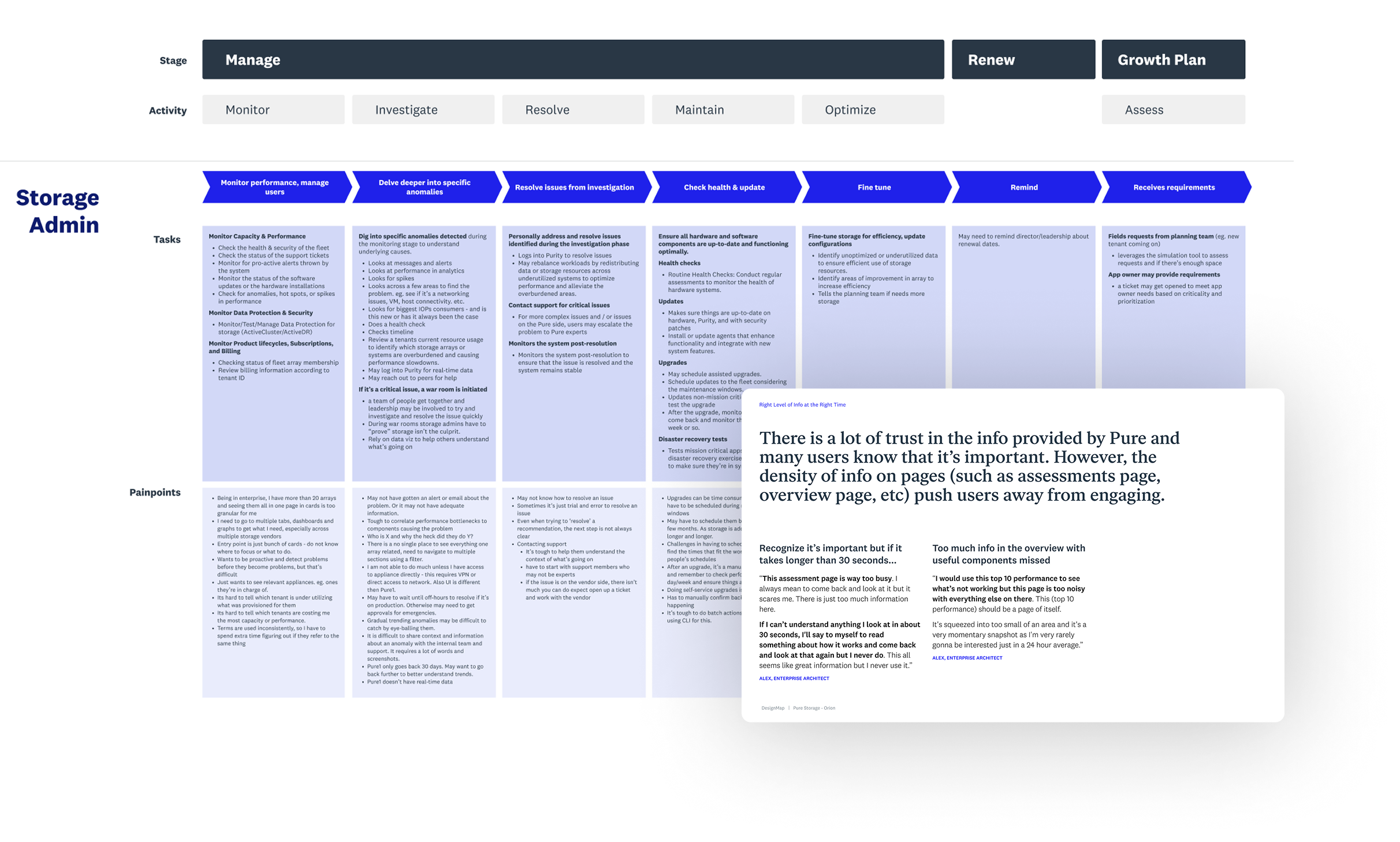
“I Can See Everything, But I Don’t Know What It Means.”
The journey map made that pain visible, showing how admins constantly lost context jumping between pages. Seeing it all laid out shifted the team’s perspective: the problem wasn’t features or UI polish, it was a lack of continuity. Once everyone saw that, the goal became clear—design a connected, end-to-end experience.
Context kept breaking
Admins lost their place every time they moved between tools like Performance, Capacity, and Analytics.
Monitoring was reactive, not proactive
Users spent more time finding issues than preventing them.
Tribal knowledge filled the gaps
Naming conventions and workarounds became the only way to navigate complexity.
The "war room" lacked a shared understanding
Admins formed ad-hoc “war rooms” to make sense of issues together, exposing the lack of built-in collaboration and shared context.
Bringing the Story to Life
User research and journey mapping made the pain visible. Through interviews and workflow mapping, we saw how admins constantly lost context jumping between pages. Seeing it all laid out shifted the team’s perspective: the problem wasn’t missing features or UI polish, it was a lack of continuity. Once everyone saw that, the goal became clear: design a connected, end-to-end experience.
Exploring Ideas Rooted in Real Problems
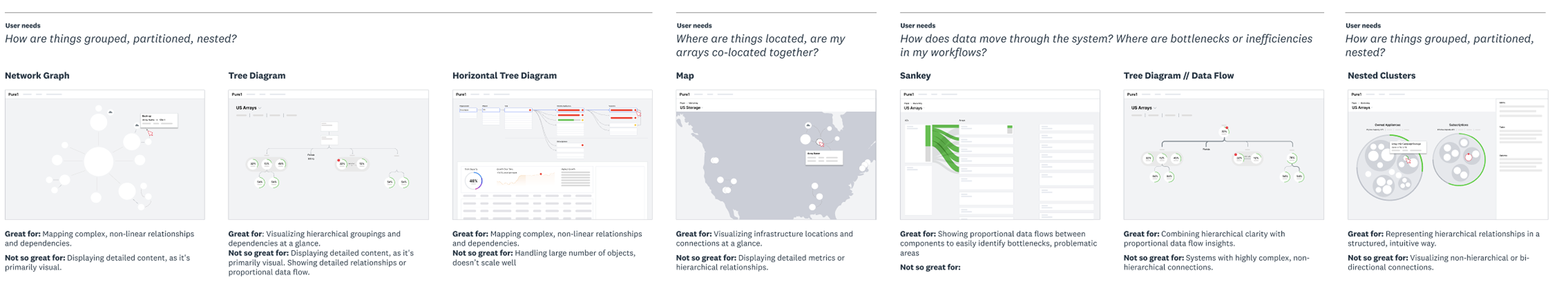
To help admins see how everything connects, I explored new ways to visualize relationships across the system. The goal was to bring clarity to complex environments, showing not just what was happening, but where and why.
Visualizing Storage
Network Graphs
Mapped complex, non-linear dependencies between systems; great for big-picture understanding but less effective for detail.
Tree Diagrams
Clear for showing hierarchy and grouping at a glance; useful for visualizing scale and relationships.
Map Views
Grounded the experience in real geography, helping reveal co-location risks and site-level dependencies.
Data Flow (Sankey) Diagrams
Illustrated proportional flow and bottlenecks, making system dynamics easier to grasp.
Each concept brought us closer to a single idea: help users see the system as a connected whole, not a collection of parts.
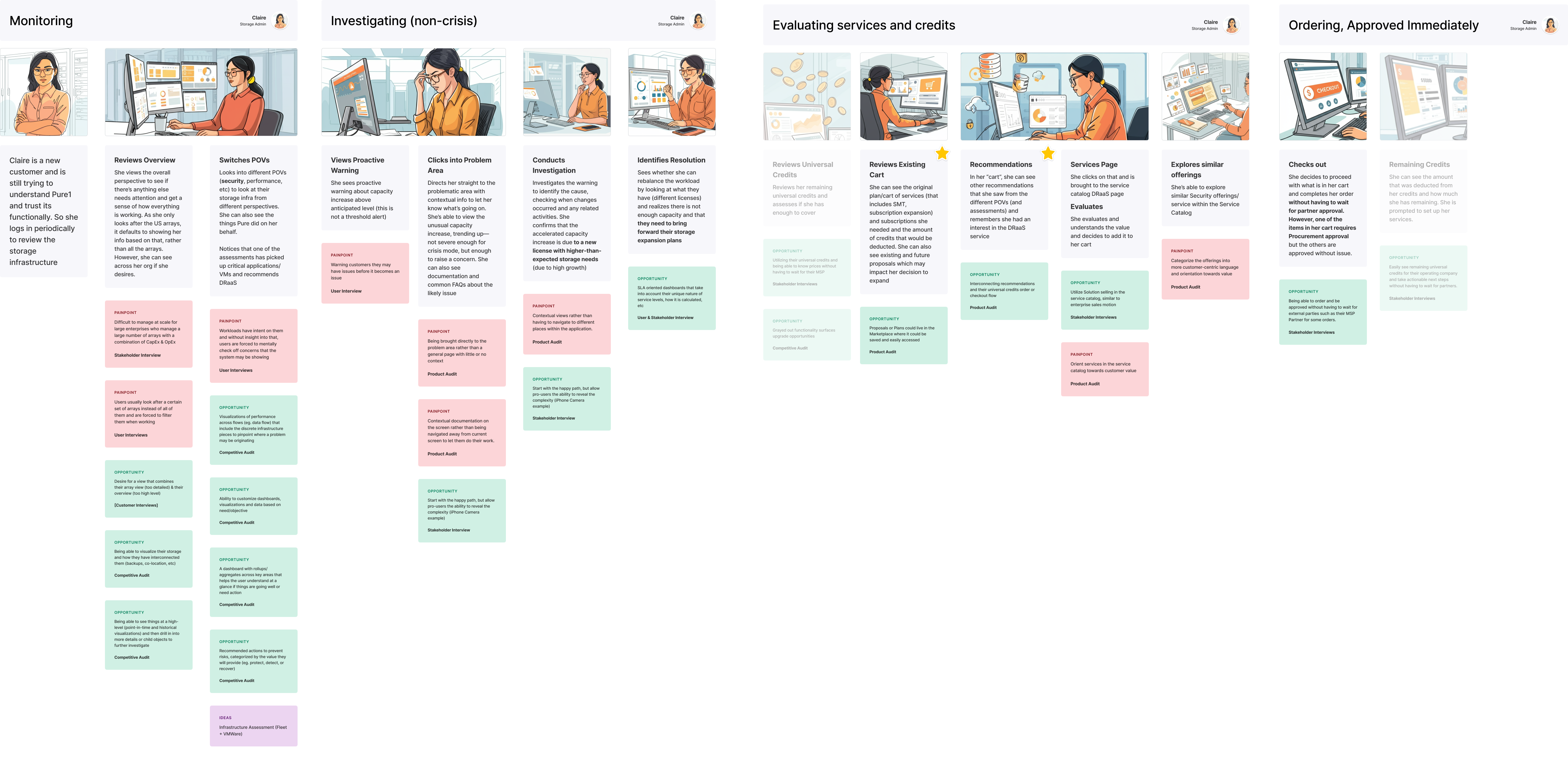
Admins managing large fleets struggled to see the full picture. The dashboard showed data but not direction, forcing them to jump between views to answer one question: What needs my attention right now?
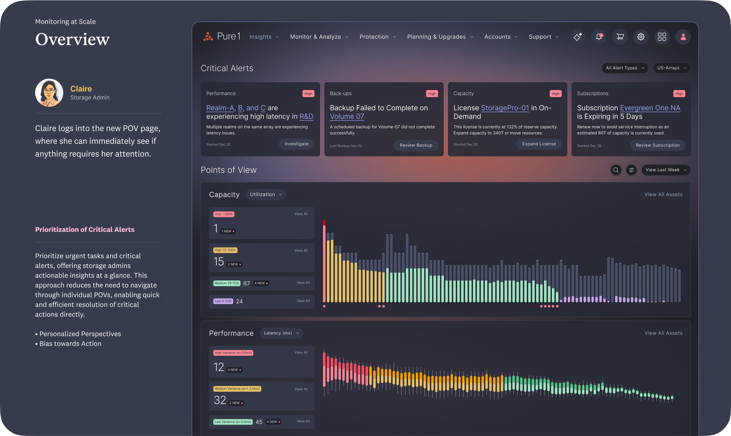
Points of View (POV) had been an internal idea before, useful in theory but lacking actionability and real connection to data. We helped bring it back to life by grounding it in user intent. Each POV focused on what mattered most for roles like performance, capacity, and reliability, surfacing clear insights that could drive action. It became a unifying concept the team and leadership could rally around.
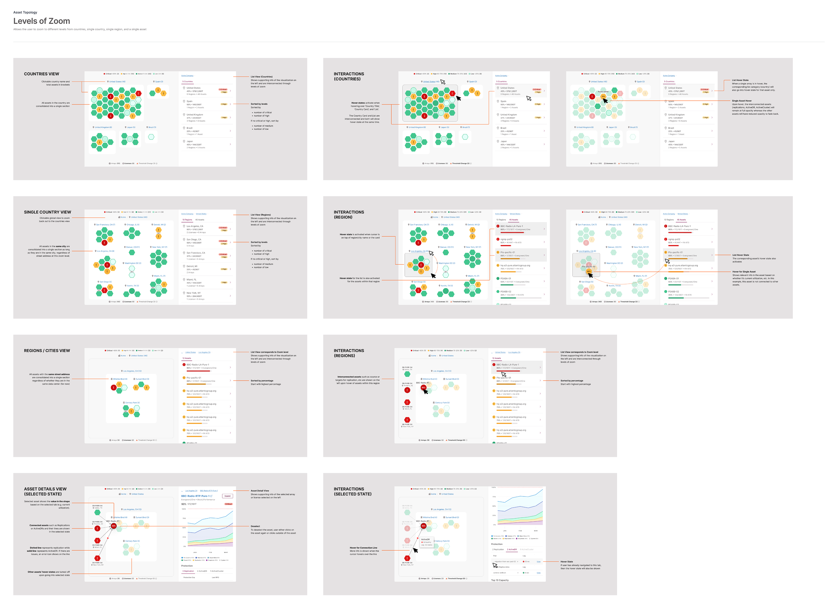
I explored ways to make scale feel simple. Fleet-level dashboards provided a high-level snapshot, while zoom levels allowed users to move seamlessly from a company view down to specific sites, assets, and realms. Visual tools like heatmaps and clustered groupings helped surface outliers and trends instantly.
We shared early concepts with admins who manage large fleets to see how well the ideas held up in real workflows. They immediately understood the value of the new Points of View, heatmaps, and centralized array pages. It made big environments easier to read and act on.
They wanted things to feel predictable and consistent, with clear labels and navigation that didn’t make them start over. The feedback confirmed we were solving the right problem: helping admins stay oriented and move from awareness to action without losing context.
Where the Vision Became Tangible
We brought the vision to life through a working prototype that showed how everything connected. It followed an admin from fleet view to asset details, carrying context at every step. The prototype made the vision tangible—helping teams and leaders see, click through, and believe in what “simple at scale” could be.
Vision Prototype

Making It Real
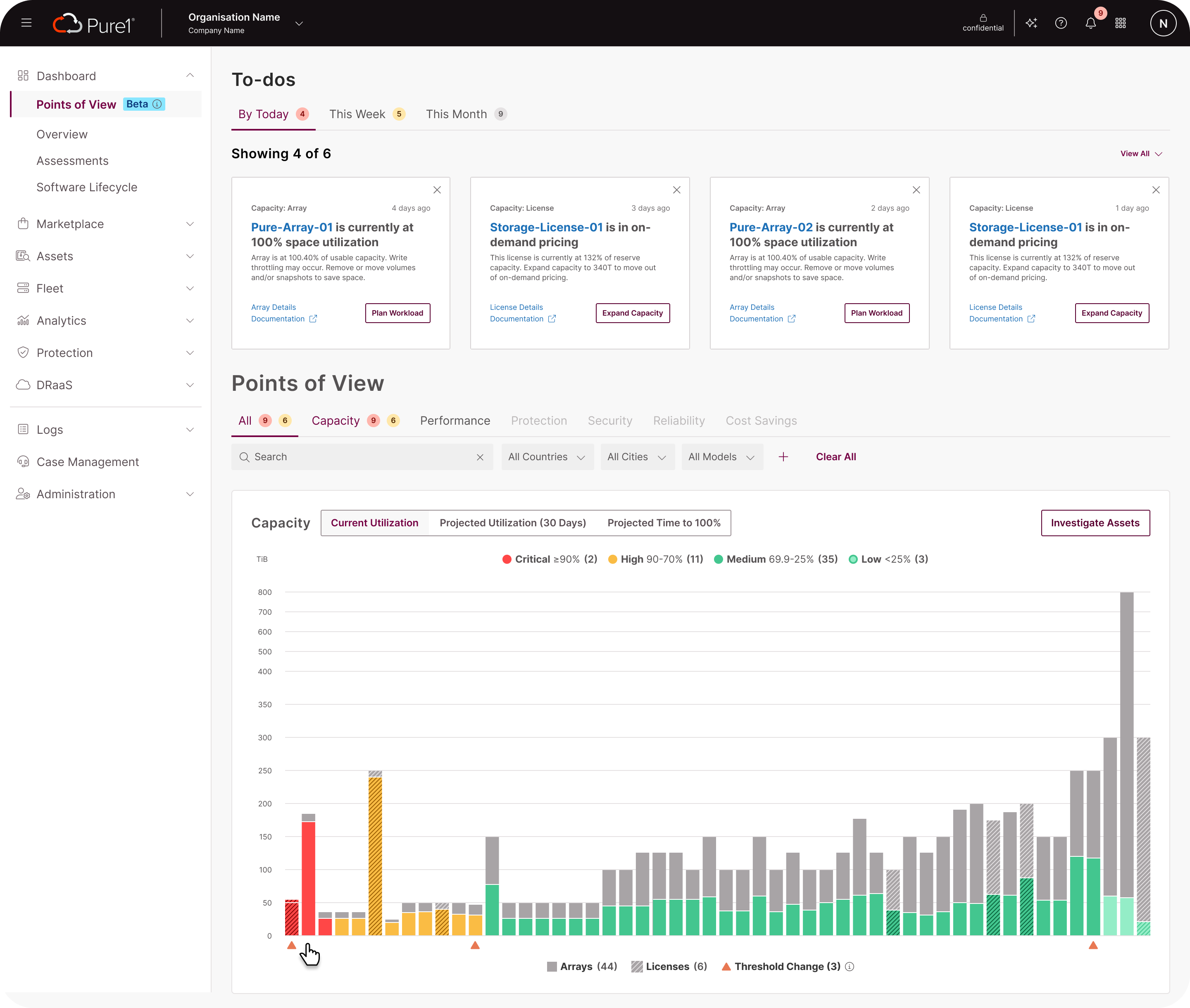
After the vision wrapped, we extended the work for five weeks to bring monitoring to life within Pure1’s existing design system and data constraints. The goal was to prove that the vision wasn’t just aspirational but buildable.
I partnered with product and engineering to adapt key concepts into production-ready flows, detailed specs, and reusable components. Because the groundwork was already strong, the lift was lighter than expected. The ideas fit naturally into the current system, showing that clarity doesn’t always require reinvention. This phase turned the visiontype from a story into a working foundation that teams could ship, scale, and continue to evolve together.
Production Prototype
Where We Landed
Accelerated internal alignment
The shared vision, design principles, and visiontype gave product and engineering a clearer north star. Teams were finally aligned on what “good” or “simple” looked like, turning abstract goals into actionable direction.
Set a foundation for scale
The work reframed how Pure thinks about monitoring—less about dashboards, more about intent. It created a foundation teams can now evolve from, ensuring clarity and continuity at every level.
Design moved from concept to implementation
The activation sprint proved the vision was buildable. Using the existing design system and live telemetry data, we delivered production-ready prototypes that product and engineering teams began integrating into their next release.
Unlocked enterprise opportunity
Making monitoring easier for admins managing 50+ arrays opened the door to larger customers. The improvements removed key usability barriers, helping Pure tap into an estimated $25–40M in new annual revenue from expanded enterprise adoption.
What I Took Away
Modeling to Earn Trust
At first, there was doubt that anyone outside Pure could understand its complexity. The models changed that. They showed we got it—the system, the logic, the why. What began as a design tool became a shared language, even used to onboard new hires. Modeling didn’t just simplify, it built trust.
Alignment Happens in Small Rooms
Workshops sparked ideas but rarely clarity. The real progress came from one-on-one conversations—where context surfaced, feedback was honest, and alignment finally clicked.
Simplicity Takes Work
The hardest part wasn’t adding, it was editing. Deciding what to hide, what to surface, and how to say less without losing meaning took iteration and restraint.