Making MS Care More Inclusive
Improving accessibility and velocity through design system evolution.
Healthcare
Accessibility
Design System
Patient Experience
Mobile
Featured in Fast Company
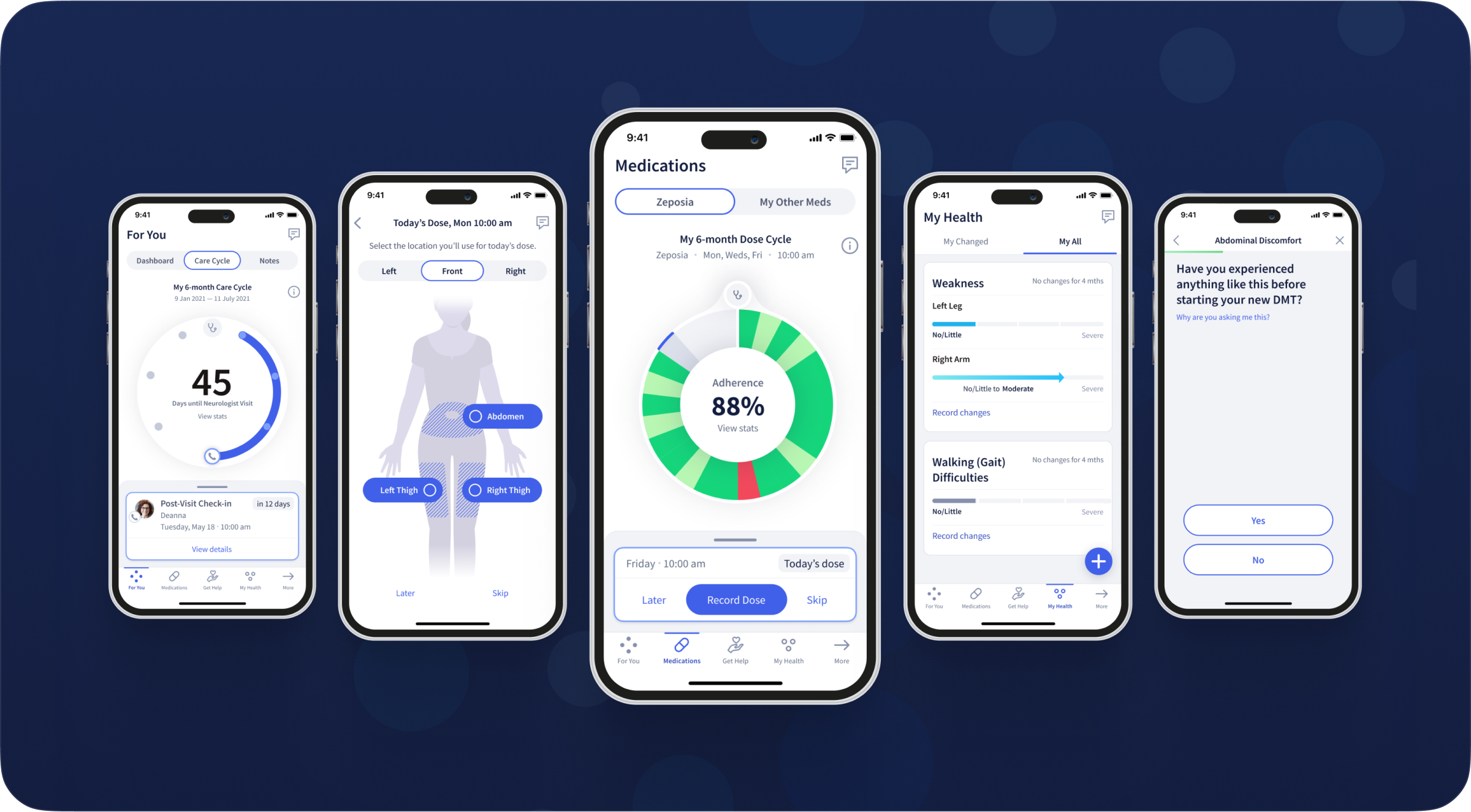
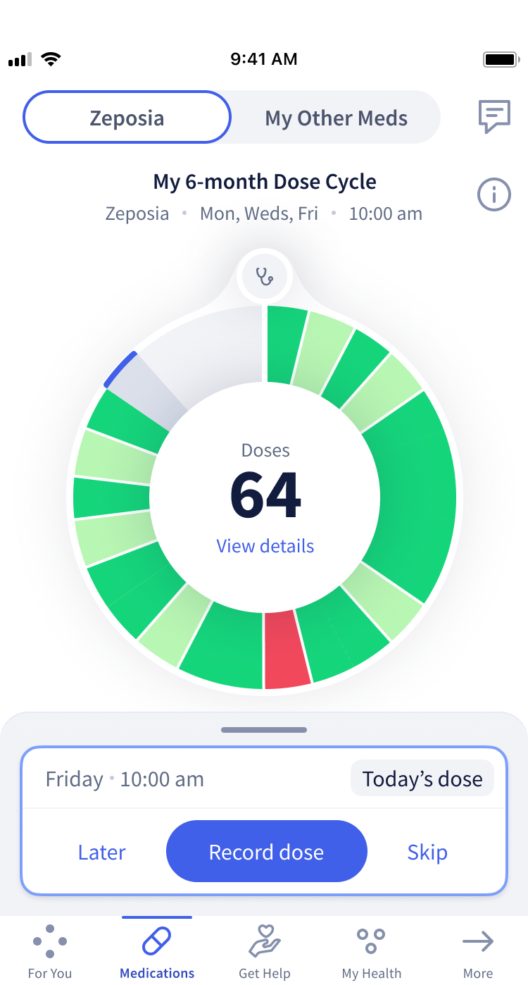
Started With Features, Ended With a System Fix
The Octave MS Care app and program helps people with multiple sclerosis manage their treatment and connect with care teams.
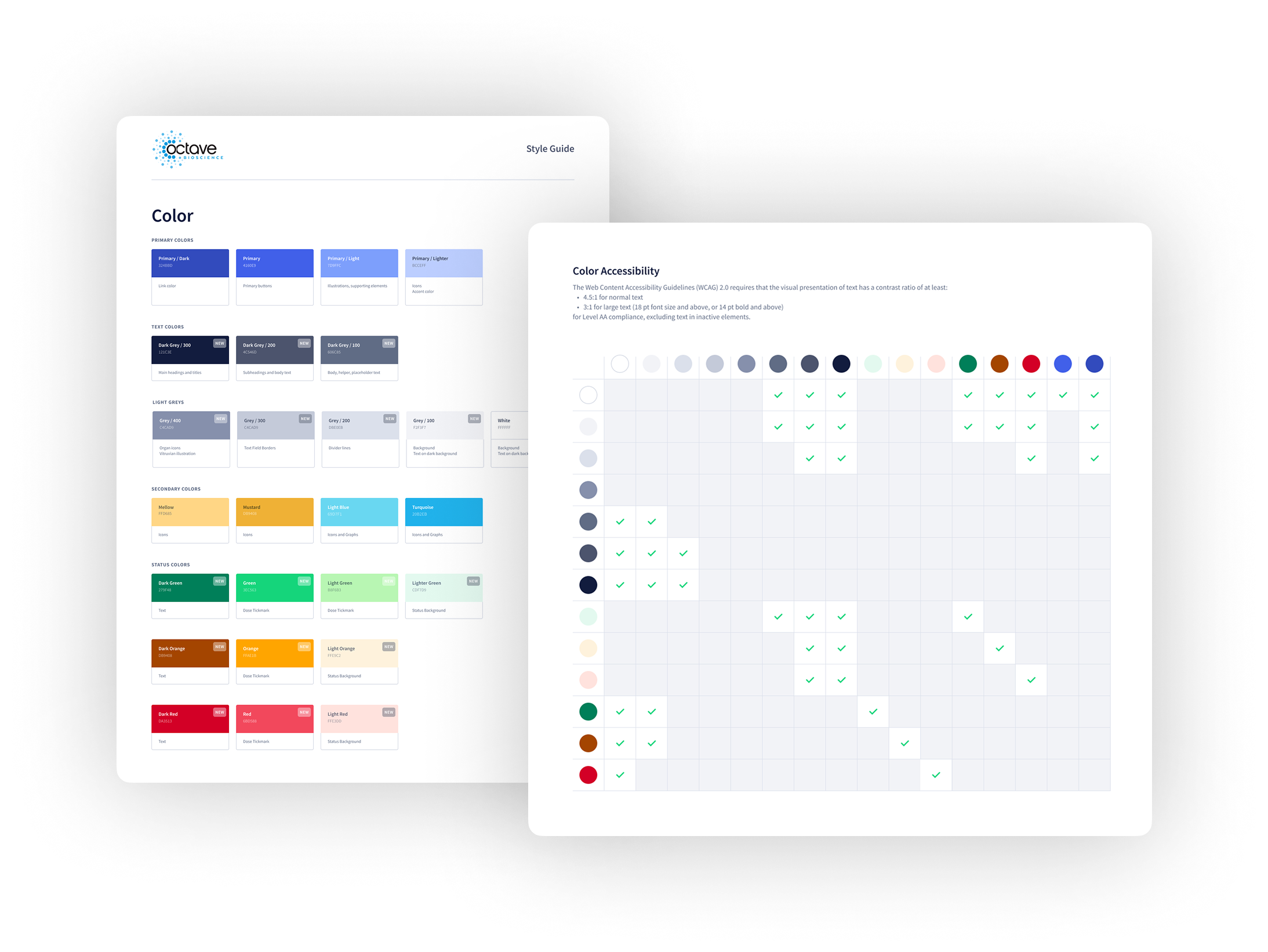
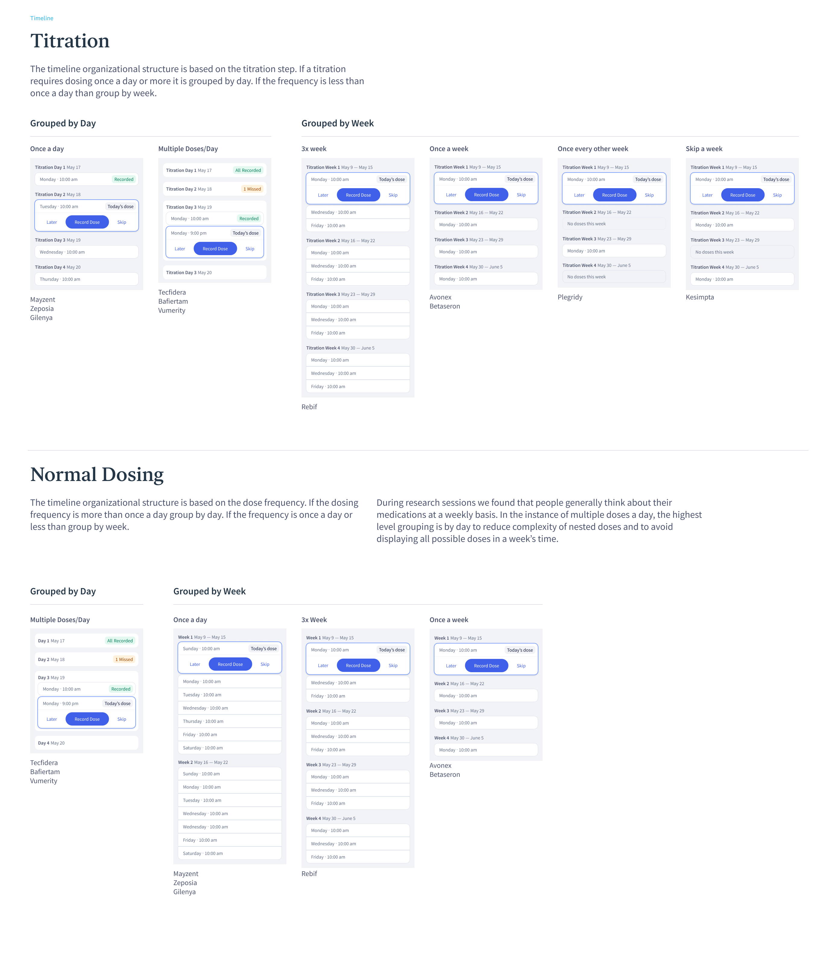
I was brought in to design and test new features for the patient experience, but early on, it became clear the foundation needed work. The design system was inconsistent, difficult to scale, and not meeting accessibility standards. This was especially critical since low vision and color blindness are common symptoms of MS.

I rolled up my sleeves, ran a full audit and worked with engineers to fix color, components, and functionality. With product, I showed how a stronger system made features easier to ship. With leadership, I made the case that accessibility and scalability were investments in better care and faster product growth.

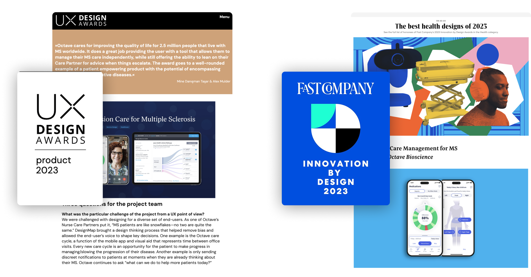
Together we shipped a refreshed design with new patient features, while building a more inclusive system and a stronger foundation for the product to grow. The work went on to be recognized by Fast Company’s Innovation by Design Awards and the UX Design Awards.
Role
Sr. Product Designer
Platforms
iOS
Industry
Healthcare
Duration
9 Weeks
Skills
Design Systems
Atomic Design
Product Audit
Visual Design
Data Visualization
Accessibility
Cross-Functional Collab
How I Tackled It
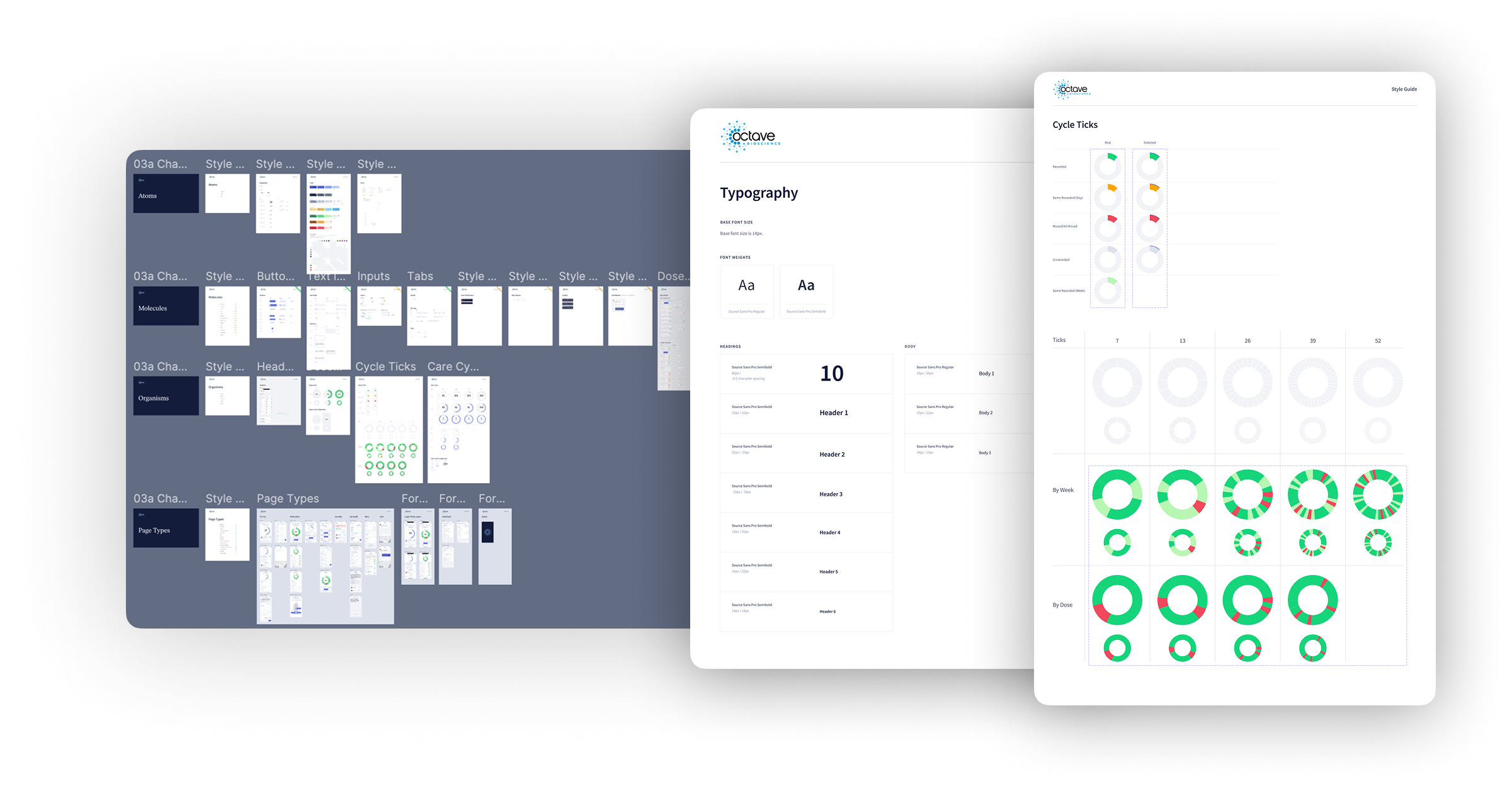
Started with an honest audit
I mapped the current UI across screens, workflows, and navigation patterns. I looked for anything that felt clunky, inconsistent, or inaccessible. From color contrast issues to duplicate components, it quickly became clear the system needed cleanup before we could confidently build on it.
Designed with flexibility in mind
I followed atomic design principles to build modular components that could be reused and rearranged across different parts of the product. The goal was to create a system that could scale and adapt.
Made documentation part of the work
Along the way, I built a guide that captured specs, usage rules, and accessibility notes. It became a go-to resource for both design and engineering. It helped keep everyone aligned and cut down on back-and-forth during implementation.
Worked in the open with the team
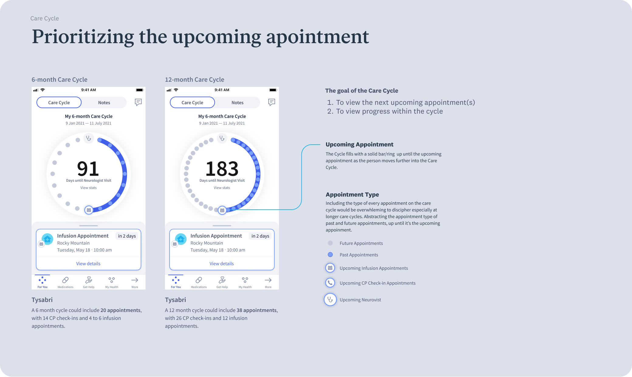
This was never solo work. I partnered closely with PMs, engineers, and other designers to shape the direction and prioritize updates. Some of the most useful conversations came from digging into accessibility edge cases with engineers. We debated how to handle color in data visualizations for low-vision users. Those discussions helped us land on stronger patterns and a more thoughtful system overall.
Why the System Wasn’t Working for Everyone
Inconsistencies across the board
Designs were scattered across multiple Figma files. Core components appeared in several variations with no documentation, creating confusion for both design and engineering teams.
Color isn’t enough
Charts relied solely on color to convey meaning, without labels or supporting values. This made the data difficult to interpret for users with low vision or color blindness.
Too much text, not enough structure
Screens were dense with information but lacked visual hierarchy. Users had to read carefully to find what they needed, which added unnecessary effort.
Harmonizing Colors While Meeting Accessibility Standards
One of the biggest takeaways from the audit was that our color system wasn’t pulling its weight. Contrast failed in key areas, and the palette felt scattered. I created a set of accessible color pairings that balanced usability with visual harmony. The guide gave designers clearer options and made it easier to build consistent and legible interfaces without the guesswork.
Improving Visibility & Comprehension
Visuals Supplemented with Data
Displaying recorded doses alongside the visual cycle, ensuring all users including those with visual impairments could understand their progress.
Larger Viz for Better Legibility
Enlarging the adherence cycle improved visibility, especially for those tracking large dose cycles.
Creating a System People Could Use
So I built what I wish had existed from day one. A clear, centralized system that laid out the foundation. The goal wasn’t just consistency. It was to give every designer and engineer a shared language to build from, no matter the feature or use case.

I pulled everything into a single source of truth. Colors, type, components, and patterns were all documented in one place with clear examples. Not just what to use, but when and how to use it.
Because the app had so many different use cases we created flexible rules that could work across the board. The documentation became a key part of how we worked. It helped designers move faster and gave engineers fewer unknowns to solve.
Where we landed
Accessibility got real
We partnered with accessibility experts to test the updates and achieved WCAG AA standards, making the app reliably usable for people with MS who experience low vision or color blindness.
Design and dev moved faster
Clear rules and modular components helped designers move quicker and engineers focus on functionality. When Octave brought on their first in-house designer, the documentation became a guidebook and helped them hit the ground running.
We saw real-world results
92% of patients stayed engaged with the app and program. That told us the work was paying off not just for the team, but for the people using it every day.
The work got recognized
The project was honored by Fast Company’s Innovation by Design Awards and the UX Design Awards, recognizing the impact of our design and system thinking.
What I Took Away
I didn’t go into this project expecting to overhaul the system. I was focused on new features at first. But once I started spotting issues I knew we couldn’t just keep building on top of that.

Even though I didn’t have all the answers, I didn’t wait for permission to fix things. I took the time to step back, clean up, and improve what was already there. Working closely with accessibility experts helped me grow. I learned how to navigate gray areas and have the hard conversations, especially around visual clarity and cognitive load. Those debates made the work better.

And I didn’t keep that learning to myself. I started an inclusive design working group at the studio and created resources to help other designers build more accessibly. What began as a personal initiative turned into something that helped the whole team move forward with more clarity and care.
Let’s build more inclusive products
I create design systems that scale with your product and your team. If you want consistency, speed, and inclusivity, let’s build it together.
Ways we can work together
Freelance
Consulting
Full-time
Reach Out