Bridging Two Brands: Data, Storytelling, and the Pulse of a Nation
Creating a Cohesive UI System for Content and Data
A national health insights hub needed to bring two worlds together. One spoke in data. The other spoke in empathy. The platform had to carry both without losing either.
I led the visual design while working closely with two client groups, each with different priorities. The team was less familiar with how brand and product design come together, so part of the work was building trust and showing how the system could be adaptable while the branding was still a work in progress.
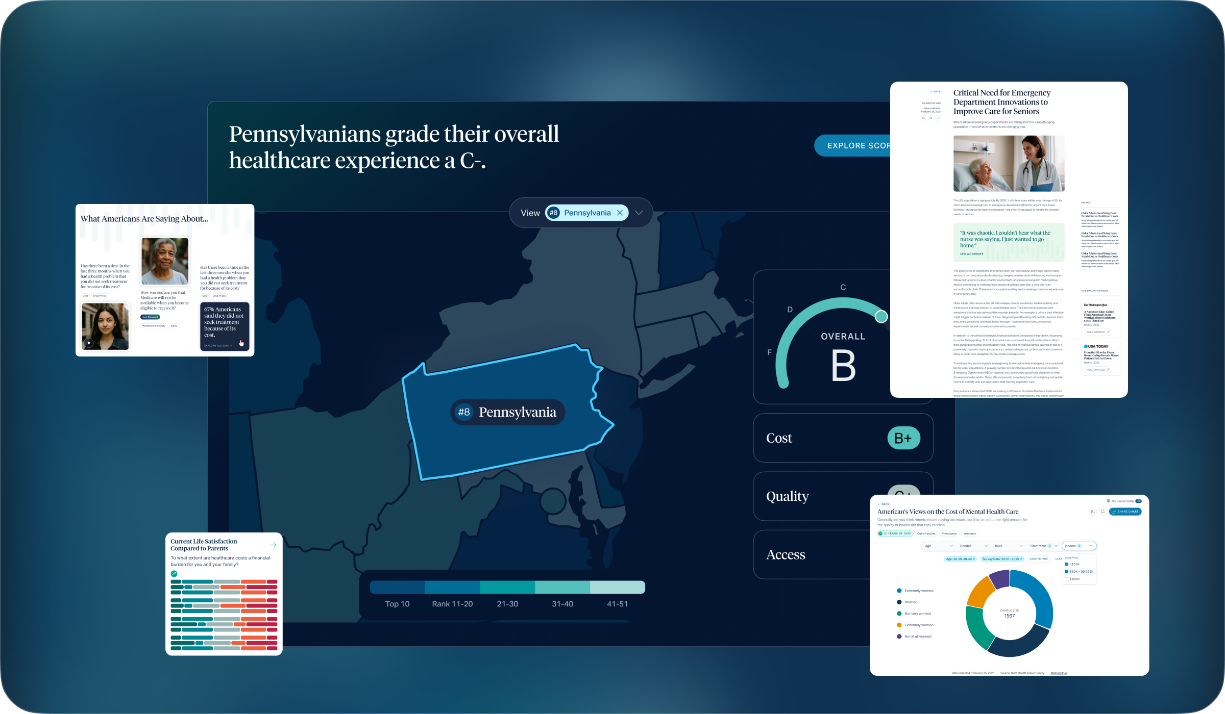
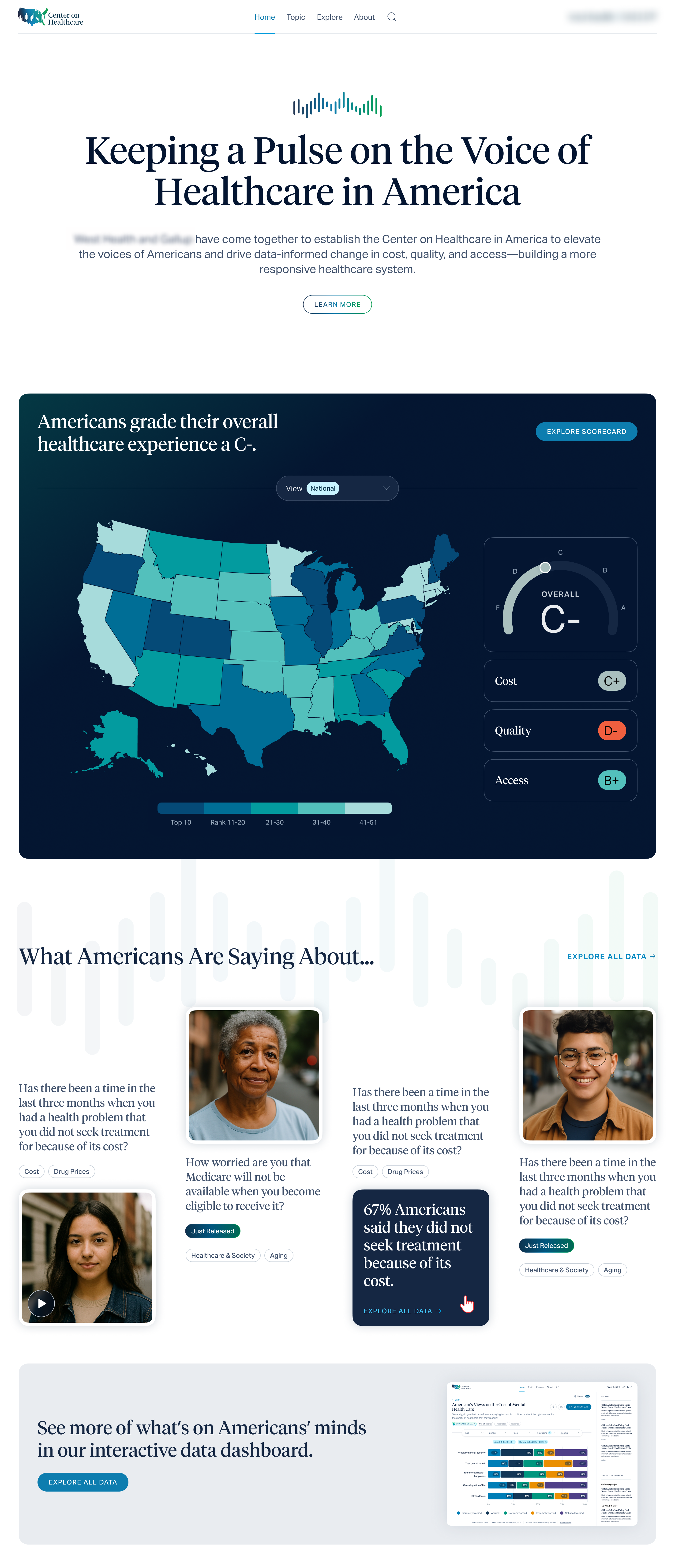
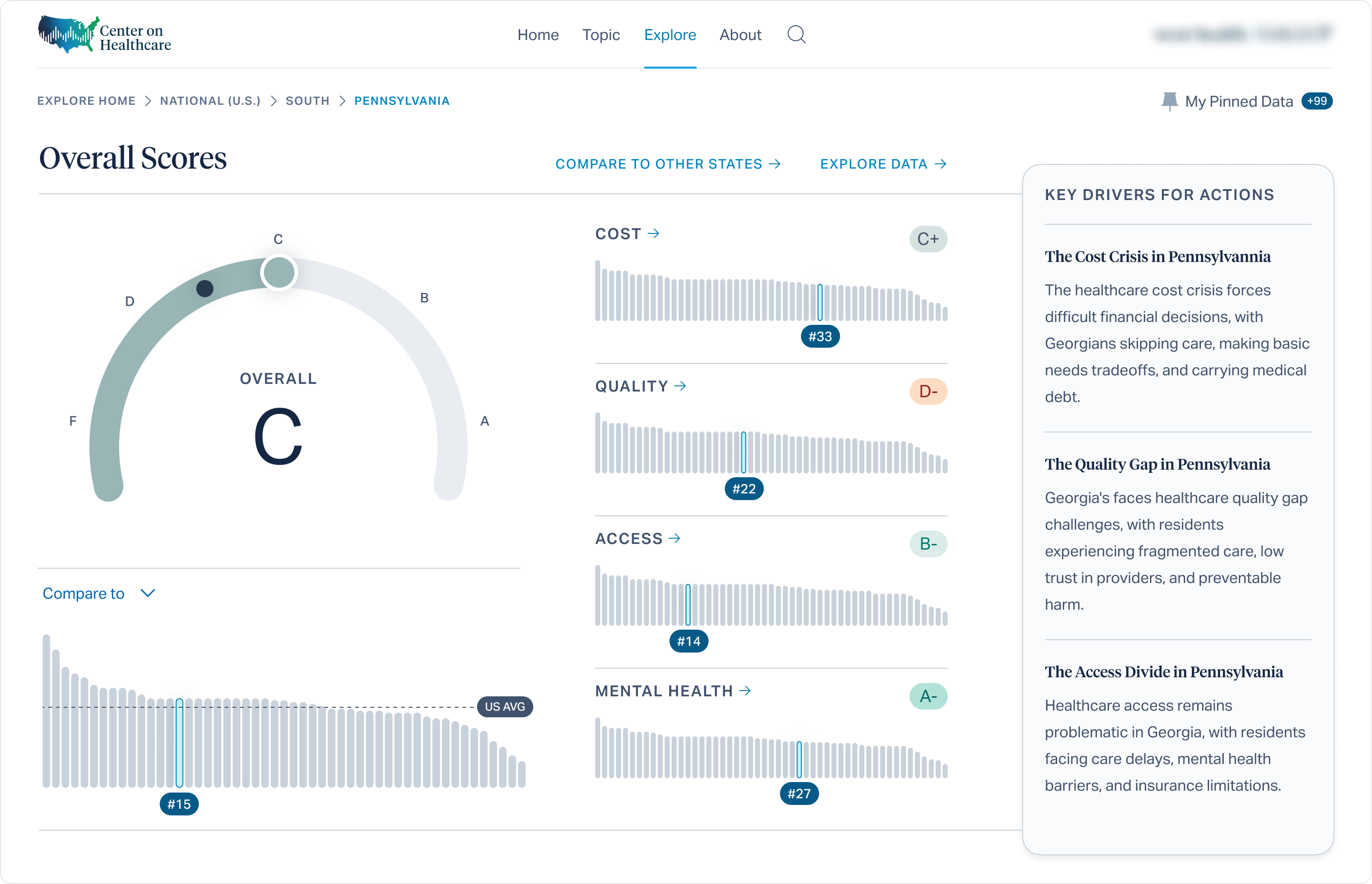
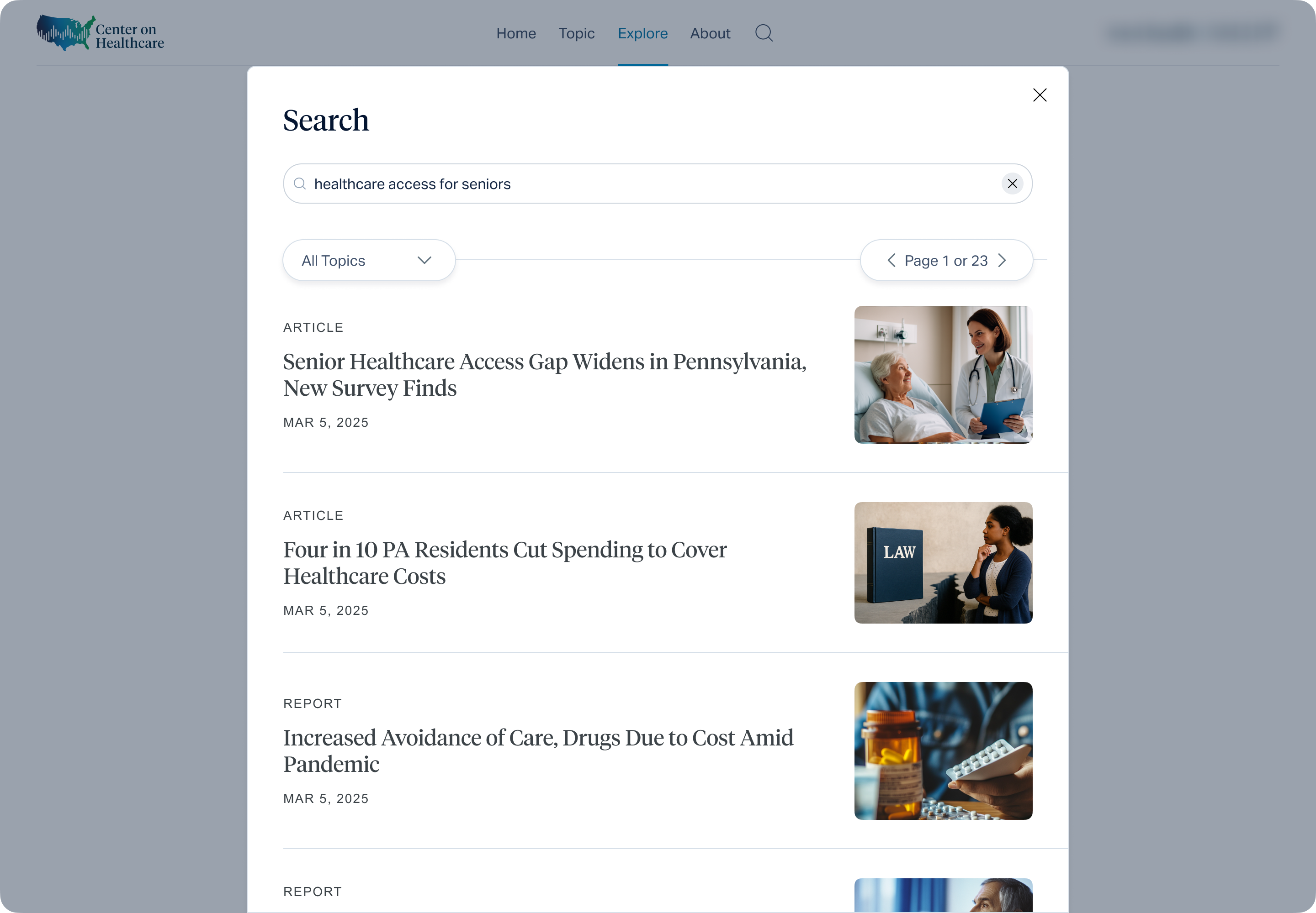
Dashboards made the numbers clear. Editorial pages made the stories approachable. The visual language held credibility while still feeling human. The result was a platform that turned complex survey data into insights people could trust and use. The clients left more than satisfied and have continued working with us, with new projects already on the horizon.
How I Tackled It
Educated and defined boundaries
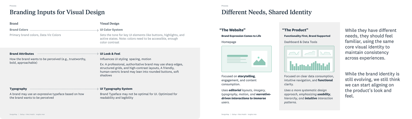
I guided stakeholders on how brand and product design could work together and drew a clear line between them. This helped everyone understand where the system could flex and where it needed to stay consistent.
Explored a range of possibilities and stayed flexible
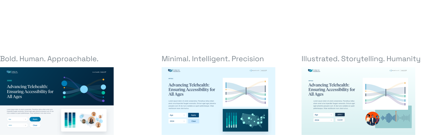
I started with three directions. one led with trust, one with personality, one with humanity. We refined them together, guided by feedback and accessibility needs. Since the product UI was more defined than the brand, we focused there first and stayed flexible for content areas. The brand was still in flux, but it didn’t change much in the end, which saved time by not waiting for it to settle.
Found the best of both worlds
After exploring multiple directions, we landed on a blend, the empathy and human connection of one brand with the trust and credibility of the other. Together they struck the right balance, creating a system that felt both approachable and authoritative.
Designed a system to hold it all together
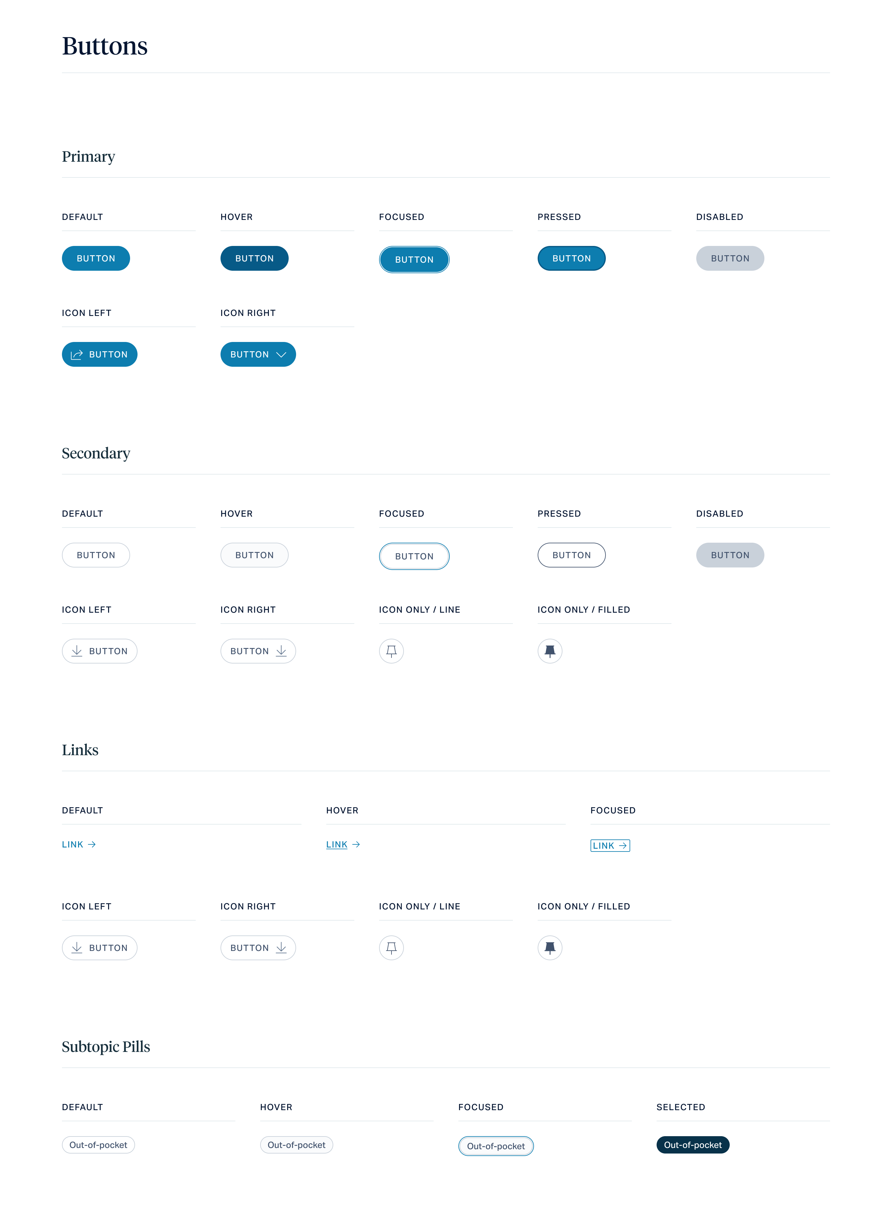
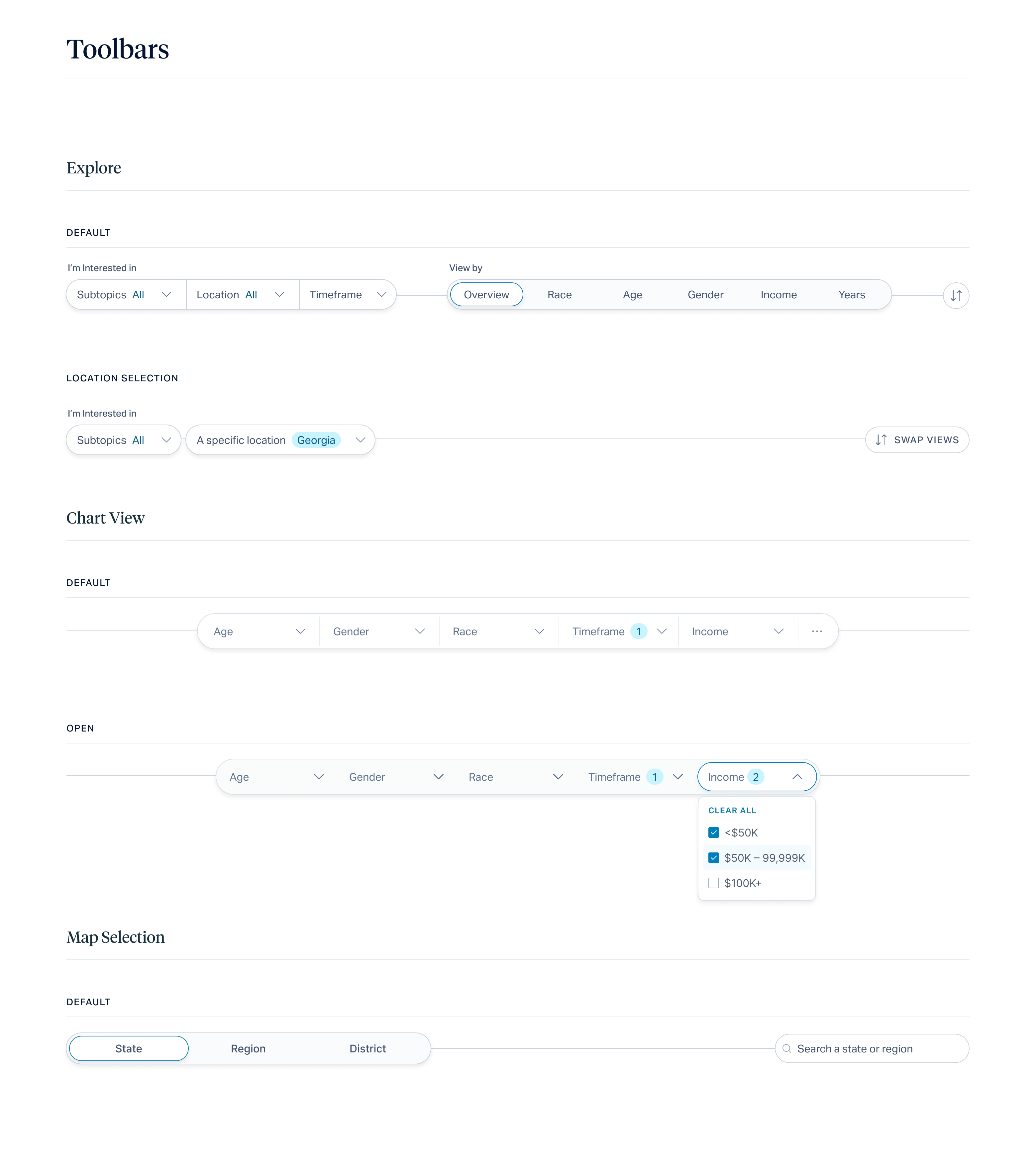
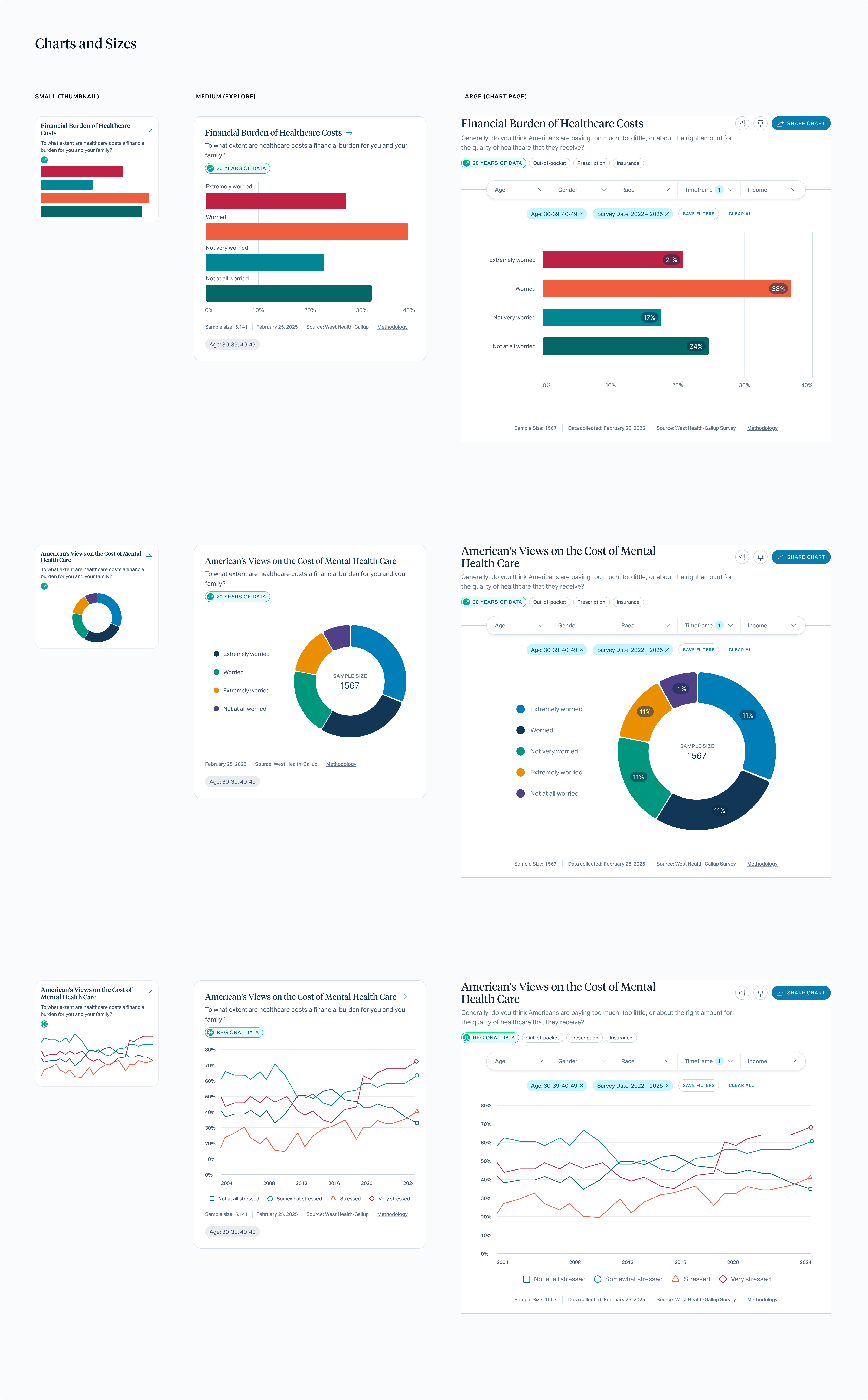
The platform needed structure that could adapt. I built a system that worked for both detailed reports and interactive dashboards. Accessible typography and color, clear iconography, and consistent chart styles formed the base. Flexible templates, all built on the same grid and rhythm, made the experience feel connected across every page.
Made the right moments shine
The system had to work everywhere, but not every moment was equal. I focused on the points that mattered most where interactivity was new or the design could guide the user to something meaningful. Those moments got extra detail, brand, and care so they felt intentional and memorable.
Where We Landed
Velocity with impact
In just 7 weeks we aligned two brands on a shared visual direction and delivered 9 unique page templates, 20+ components, and 10 scalable data visualization types prioritizing the highest-impact work to move quickly without sacrificing quality.
Trust rebuilt
The visual design phase brought clarity and confidence to a previously uncertain project. We aligned the two brand on a shared direction, delivered high-fidelity designs, and reestablished trust across teams which is paving the way for future extensions and continued collaboration.