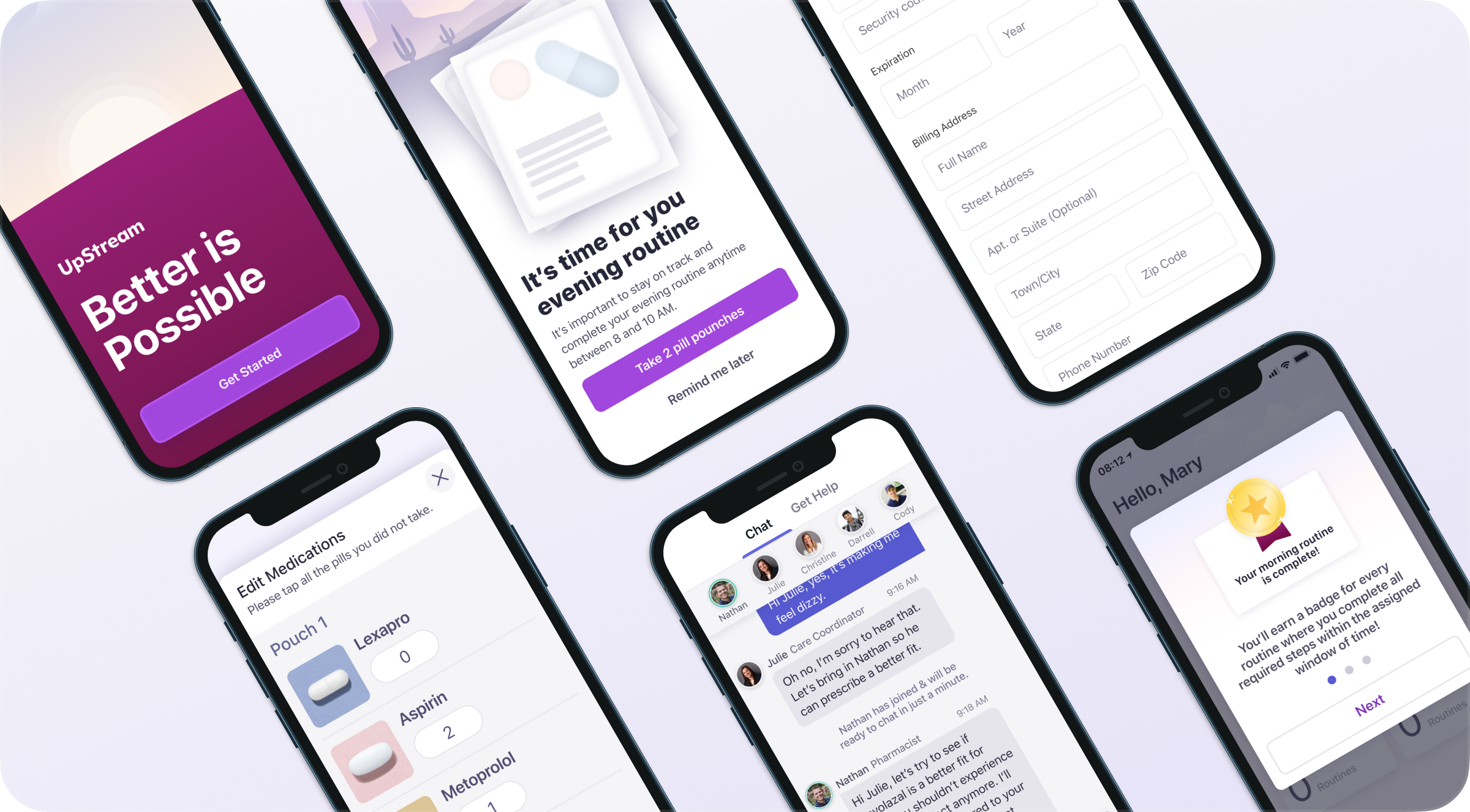
Helping Patients Stick with a Plan
Crafted an approachable visual system for a medication tracker, balancing friendliness with clinical clarity.
Healthcare
Accessibility
Design System
Patient Experience
Mobile
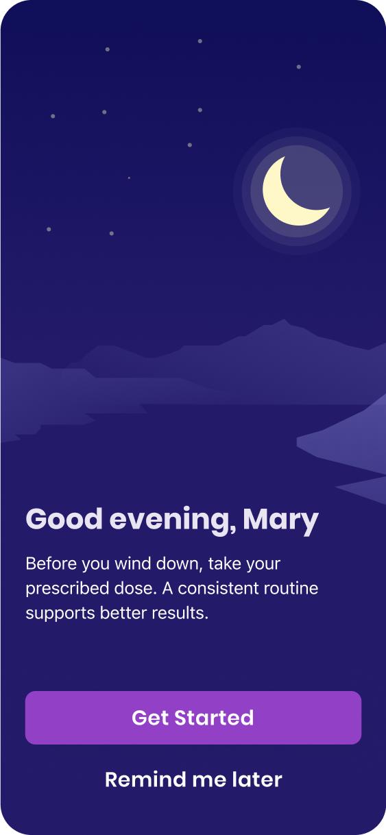
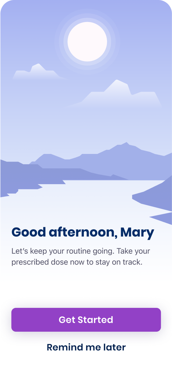
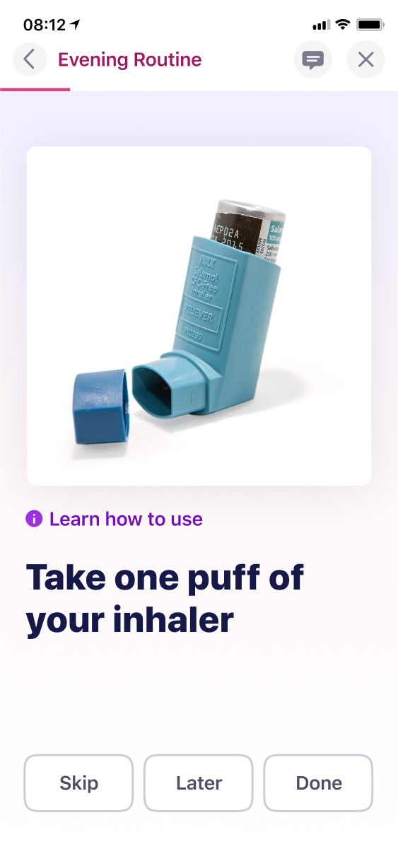
Upstream’s vision was simple but ambitious: deliver pouch-dispensed medications to patients’ doors and make it easy to stay on track. In just five weeks, we explored how a mobile app could turn complicated medication regimens into manageable habits, especially for older adults balancing multiple conditions.
Translating Brand into Behavior Change
As Visual Design Lead, I built a clean, modular UI system from the ground up, extending new brand guidelines into a scalable mobile interface. The goal was to make adherence feel intuitive, empowering, and even rewarding.  

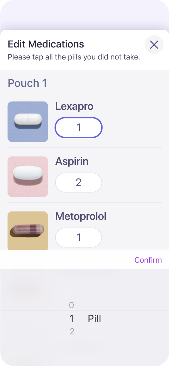
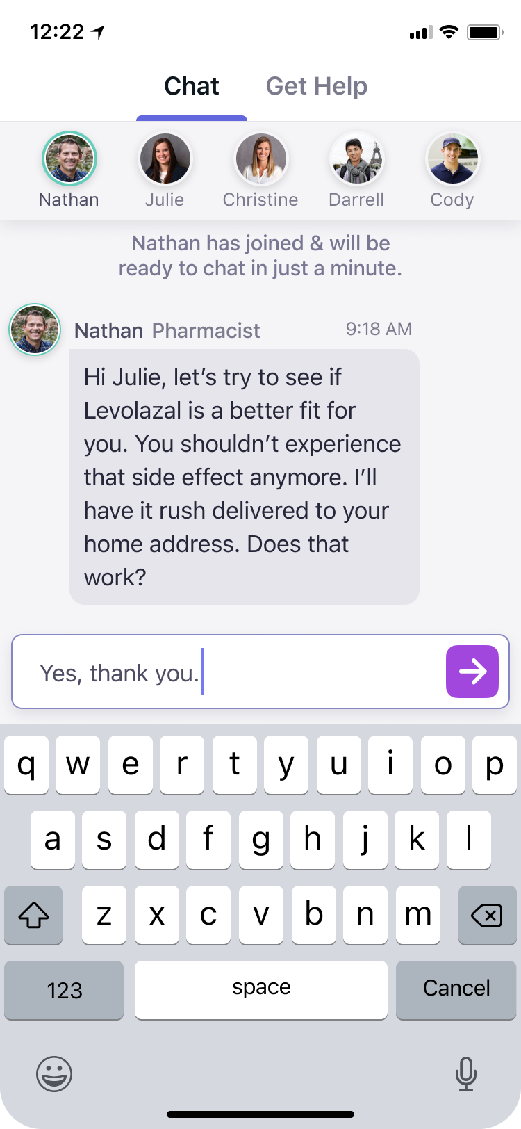
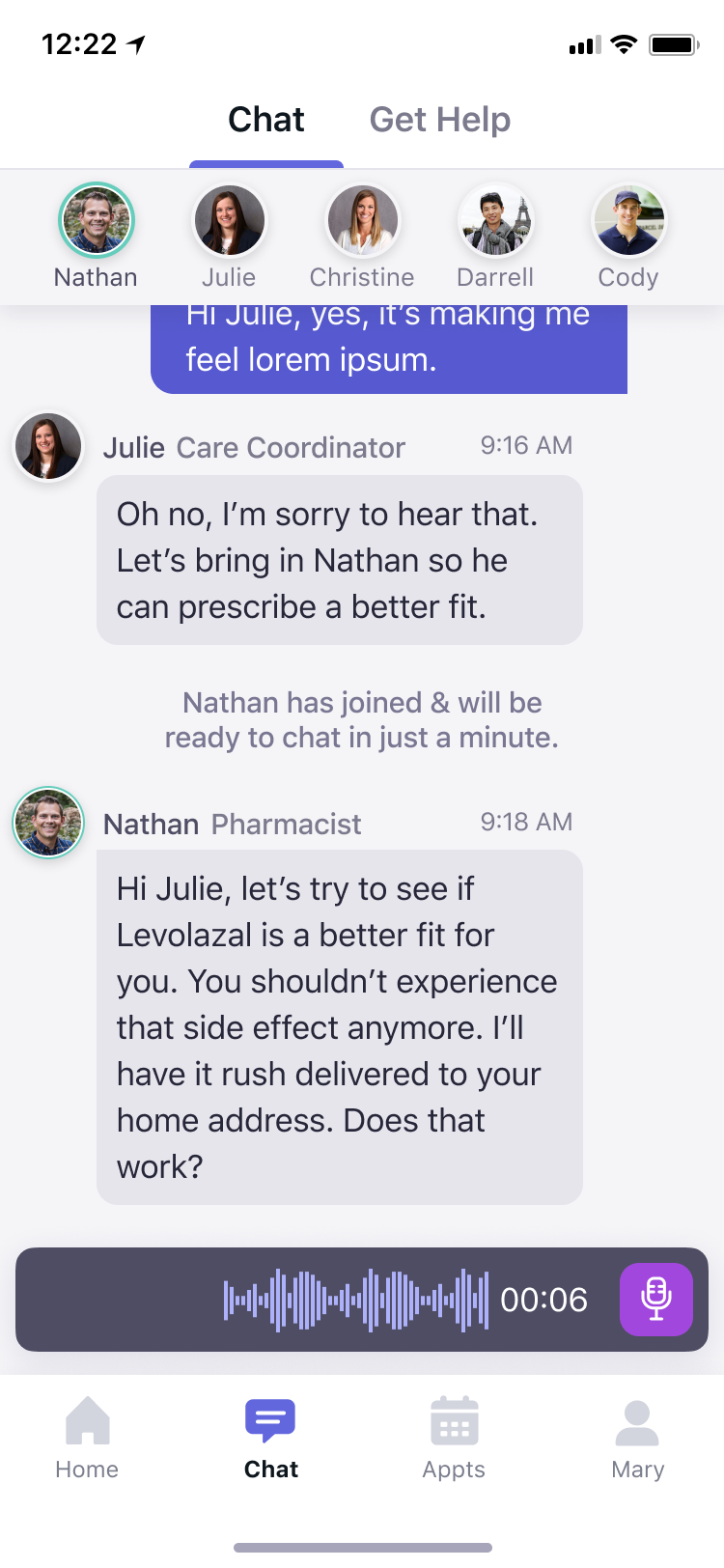
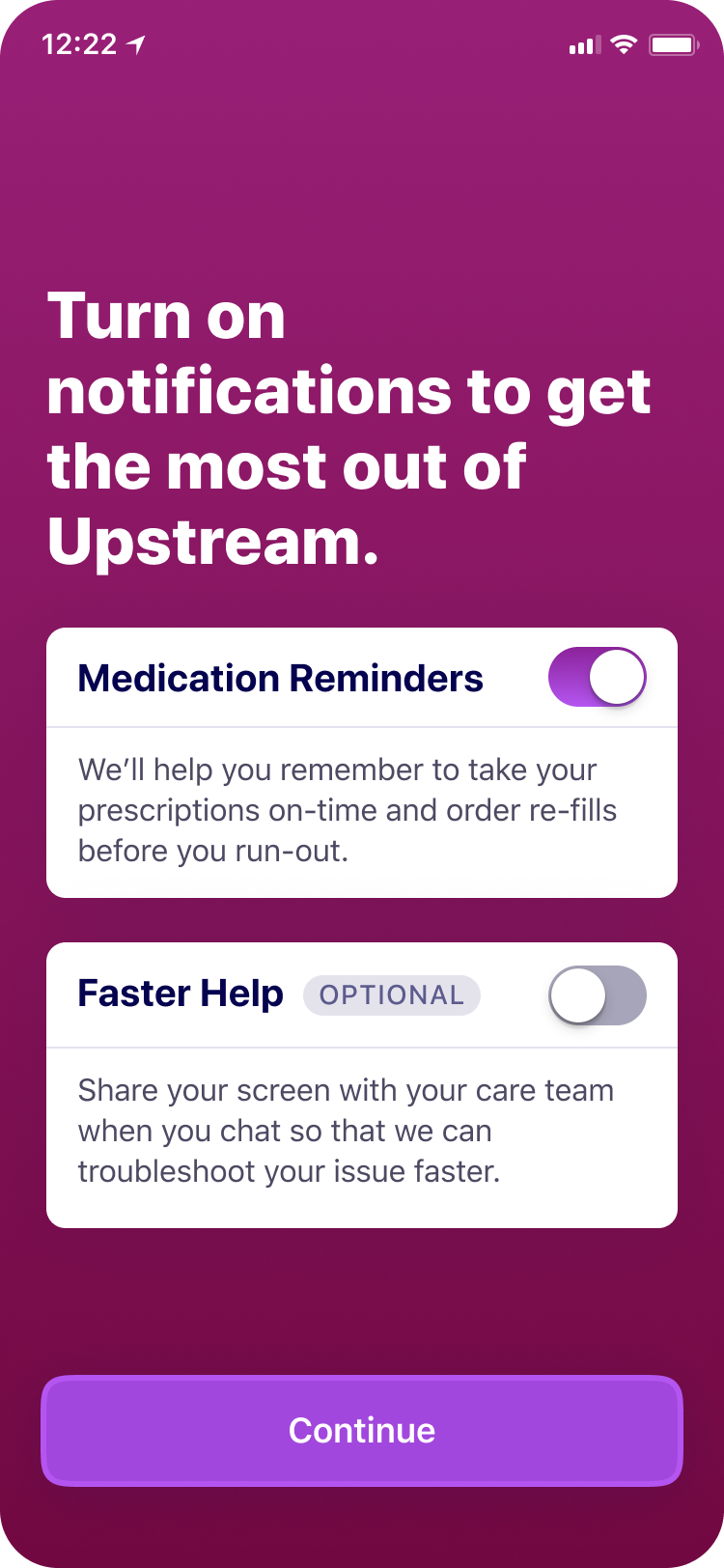
I collaborated closely with a Senior UX designer and the founder, co-designing onboarding, medication tracking, and in-app messaging workflows to ensure clarity and ease of use. The result was a prototype that felt grounded in reality and ready to test, combining thoughtful UX with visual polish to help people feel more in control of their care.
Role
Sr. Product Designer
Visual Designer
Platforms
iOS
Industry
Healthcare
Duration
5 Weeks
Skills
Design Systems
Visual Design
Component Library
Landscape Audit
Data Visualization
Accessibility
Color System
Typography
Meeting Patients Where They Are At
I used changing color palettes, illustrations and greetings to align medication reminders with the patient’s current time of day—creating a subtle, ambient rhythm that mirrors their lived experience.
Grounding the Experience in the Real World
I used large visuals of familiar objects—pill pouches, pills, and devices—to help older adults visually map the app to their real-life routines.
Grounding the Experience in the Real World
I used large visuals of familiar objects—pill pouches, pills, and devices—to help older adults visually map the app to their real-life routines.
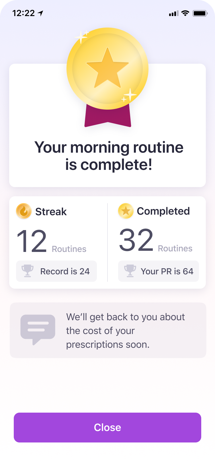
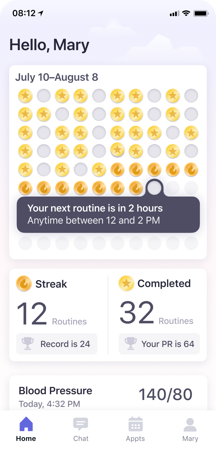
Motivating Through Gentle Gamification
We introduced badges, streaks, and progress milestones to celebrate consistency and adherence. This light-touch gamification helped patients feel recognized and motivated without turning their care into a game.
Conversational UI
I crafted a warm, approachable chat experience that mirrors the clarity and calm of a real human exchange
A Gentle Entry Point
The onboarding uses bold typography, warm gradients, and large touch targets to create a tone that feels supportive and energizing—not clinical. It’s designed to build trust quickly and make new users feel capable and encouraged from the start.
Let’s create tools that inspire people to make a change.
I specialize in designing tools that are as beautiful as they are usable—blending product thinking, visual craft, and storytelling to help your team ship with confidence.
Reach Out